 2189
2189
 2017-08-15
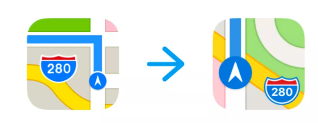
Apple has been making all sorts of tiny changes to its app icons in the iOS 11 beta. And today, it made two of the most interesting changes yet: one to Maps, and one to the App Store.
The Maps change is a bit more fun. The icon has, since the iPhone’s inception, shown 1 Infinite Loop — the location of Apple’s longtime headquarters. But with the company’s enormous spaceship campus, known as the Apple Park, now opening up, iOS designers seem to have felt it was time to make a change. So instead, the Maps icon now shows a sliver of the spaceship.

Today’s other icon change is to the App Store logo. Apple has tweaked the App Store’s icon here and there over the past decade, but this is the first time it’s lost the pen and brush that make up its shape. It’s now just a series of lines that kind of look like overlapping sticks. I don’t think anyone’s going to argue that the old icon was amazing and shouldn’t be changed, but this new one looks like some weird knockoff app that somehow got installed on your phone.
Apple’s been tweaking other icons a bit, too. It slightly adjusted the clock icon today, making the numbers a bit thicker.
Source: theverge