 3212
3212
 2017-02-13

When Apple designed CarPlay for iOS, it decided to stick with a familiar paradigm: a home button that takes you to a simple home screen of icons. That’s not a terrible idea — the interface is simple and familiar to everybody, and you don’t want to be struggling with a touchscreen when you’re supposed to be keeping your eyes on the road.
However, think about the two main things you have on a car dashboard: you glance at a map and you control your music. Currently, in order to switch between those tasks you have to tap twice: once for home, and then again for the other app. That’s not a huge problem, but it does mean extra time looking away from the road. It also could be a hassle if you don’t recall where your music app icon is (or if you don’t have “Now Playing” on your main home screen).
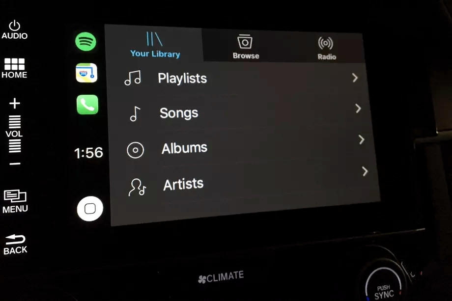
Well, with the public beta that Apple is letting users test right now, that problem is fixed. Now, instead of a single icon in the upper left-hand corner, there are three. They list your recent apps and are a much faster, easier way to switch between them. This has been around on the beta since January 24th, but it’s so helpful that I wanted to call it out on its own rather than let it be missed while everybody else pays attention to the Find My Airpods feature.
It’s not a huge change, but it is a welcome one. And it’s also a sign that Apple is thinking a little more clearly about making interfaces native to their situations. The iOS home button paradigm is simple, but slapping it on a car dashboard always felt a little lazy to me. When you’re driving, you want quick “One button, one function” interfaces, and this new update to CarPlay gets us just a little closer to that.
Source: The verge