 3052
3052
 2017-11-22

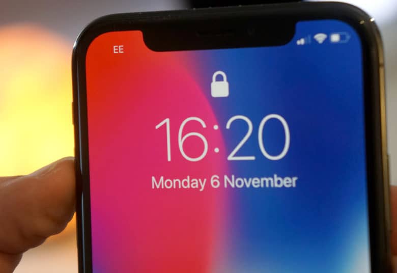
Ever since Apple unveiled the iPhone X, naysayers have been complaining about “the notch.” But in today’s video, I’m going to do my best to convince you that the controversial cutout at the top of the iPhone X screen is totally not an issue.
Here’s why I think the iPhone X actually needs the notch.
It’s notch an issue
People’s main complaint about the iPhone X notch is that it gets in the way. But if you’ve seen our iPhone X review, you know from our experience that after spending some time actually using the phone, you just don’t notice the notch.
It sits at the top, primarily to house the front-facing TrueDepth camera system, which powers iPhone X’s Face ID facial recognition system (and Apple’s Animoji feature).
Sure, the sophisticated hardware array takes up some space. But the notch does not get in the way when browsing the web or watching videos (especially if you don’t have them scaled up edge to edge). Even then, the notch doesn’t bother me!
The only real downside about the notch is that it leaves less room for information, such as the iPhone X battery percentage.
Unfortunately, Apple doesn’t offer a solution for showing this crucial info other than to swipe down to show the Control Center or a Notification Center widget. Would it have been that hard to give us the option to customize the notch to show a percentage instead of just the battery icon? No.
iPhone X notch: It’s all about the Apple brand
So, why does iPhone X need the notch? It’s all about branding.
Companies, especially Apple, love to show icons of their products. The images look nice and clean on websites, apps and manuals.
With previous models, the iPhone icon showcased the Home button. It set the device apart in a sea of Android phones with capacitive or on-screen buttons.
With the Home button missing from iPhone X, the notch takes its place — on the icon as well as the phone. If you were to draw the iPhone X without a notch for an icon, it’d just be another rectangle. The notch makes it easy to differentiate the iPhone X from other phones. It’s the main distinctive visual feature.
Apple’s designers undoubtedly see the notch as a feature, not a design mishap. The iPhone X icon makes it stand out from other devices.
Why devs love the iPhone X notch
All that aside, the notch actually helps me. For example, I tend to go to sleep long after my fiancee is already fast asleep. That means I must creep into bed in the pitch black. Then I fumble around for my iPhone wire and plug it in. I’ve usually got a website or video playing. Thanks to the notch, I can easily see which end of the phone is the top.
Finally, while the notch does take away space from the information in iPhone X’s status bar, that means it doesn’t interfere with portrait-mode apps. It cuts out some space at the top, but app developers can work with the area below the notch.
Source: cult of mac