 3602
3602
 2017-09-15
Given the iPhone X's design was leaked months before it was unveiled, many people wondered how Apple would choose to approach the notch housing the device's new TrueDepth front camera and facial recognition system.
Now that the iPhone X is official, we know the answer. Apple's new human interface guidelines for the device advise developers to embrace the notch by ensuring the layout of their apps fill the entire screen.
In fewer words, Apple doesn't want developers to hide the notch or swipe indicator by placing black bars at the top and bottom of the screen.

Apple says most apps that use standard, system-provided UI elements like navigation bars, tables, and collections automatically adapt to the device's new form factor. Background materials extend to the edges of the display and UI elements are appropriately inset and positioned.
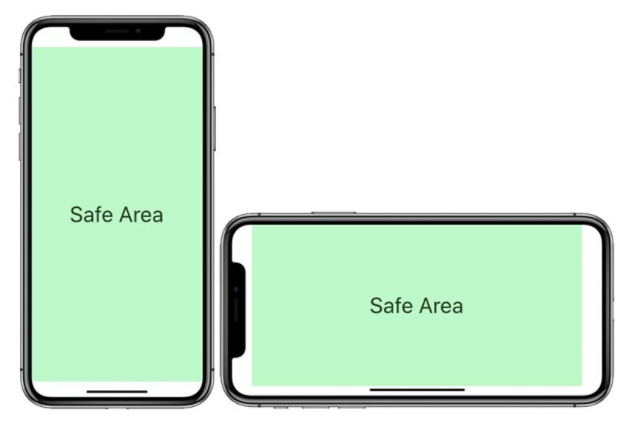
To ensure that content isn't clipped or obscured by the iPhone X's rounded display edges, sensor housing, or swipe gesture indicator, all apps should adhere to Apple's safe areas and layout margins to ensure approval on the App Store.
Apple also instructs developers not to place interactive controls at the very bottom of the screen, or in the corners, to avoid interfering with gestures such as swiping up from the bottom edge to return to the home screen.
Source: macrumors