 3272
3272
 2018-01-25
A new iOS 12 concept illustrates a mix of ideas – one good, one likely to get mixed views, and a couple of wish list fantasy items thrown in for good measure …

The idea I really like is grouped notifications. Instead of a purely sequential stream of notifications, iOS would group them logically by application.
For example, if you had three new messages, these would all be shown together. Similarly for reminders, app updates and so on.
One idea almost guaranteed to divide opinion is Android-style widgets on the Home screen.
The latest addition to our iOS 12 concepts envisions the ability to rearrange the HomeScreen layout freely and add widgets. These features have been prominent in many mobile operating systems for a extensive time and has been a long awaited feature for iOS users.
Personally, I’ve been saying for years that iOS needs to evolve beyond the static grid Home screen, but I’m not sure that the Android model is the right one to follow here. Windows Phone didn’t quite get it right here with live tiles either, but I did feel that was a better effort. I’m sure if Apple tasked its UI experts with coming up with a better approach, they would.
Apple’s current approach to widgets requires 3D Touch and deep pressing app icons to access widgets from the Home screen, or adding widgets to Home screen zero.
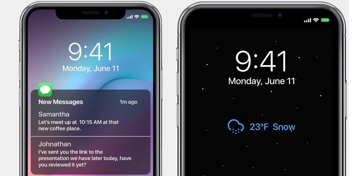
Finally, there are a couple of pure fantasy items thrown in to the mix. Extended cloud storage – which imagines Apple extending the current 5GB of free storage tenfold – and an always-on OLED display which I think simply isn’t technically feasible today.
We have seen one very popular iOS concept recently: system-wide dark mode. We’ve also seen what a next-generation iPhone X might look like with a smaller notch and bezels.
Source: 9to5mac