 3005
3005
 2018-01-19
Apple today has rolled out a major redesign for the App Store web interface. The new redesign replaces the dated and clunky interface that previously housed the App Store on the web…
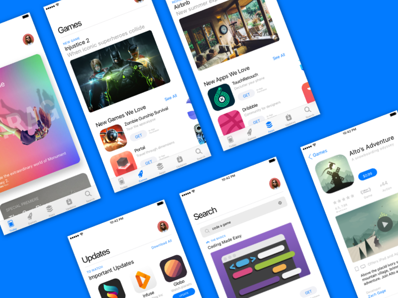
The new redesign takes cues from the all-new App Store in iOS 11, which offers larger images, a focus on curation and reviews, and more. On the new webpage, you’ll see a larger app heading, preceded by “This app is only available on the App Store for iOS devices.”
Beneath that are screenshots, the app description, update information, reviews, and specific details such as app size, device compatibility, and more.

As part of today’s redesign, Apple is showcasing app screenshots from the iPhone X. Previously, the web interface used the old square interface of screenshots from older iPhone devices. In the case of screenshots from apps that are not optimized for iPhone X, Apple still shows the older images.
Furthermore, the redesigned web interface comes following Apple’s decision to remove the App Store from the iTunes desktop application. With iTunes 12.7 last September, Apple dramatically simplified the content offerings in iTunes, removing things such as Books, the App Store, and iTunes U.
Apple rolled out a similar redesign for Apple Music on the web last year. Now, both the Apple Music and App Store web interfaces will be familiar to anyone who has used their iOS counterparts.
Source: 9to5mac