 2706
2706
 2017-11-23

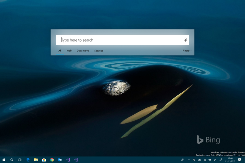
Press clover-space on a Mac (aka apple-space or command-space to Apple users) and you get a search box slap bang in the middle of the screen; type things into it and it'll show you all the things it can find that match. On Windows, you can do the same kind of thing—hit the Windows key and then start typing—but the results are shown in the bottom left of your screen, in the Start menu or Cortana pane.
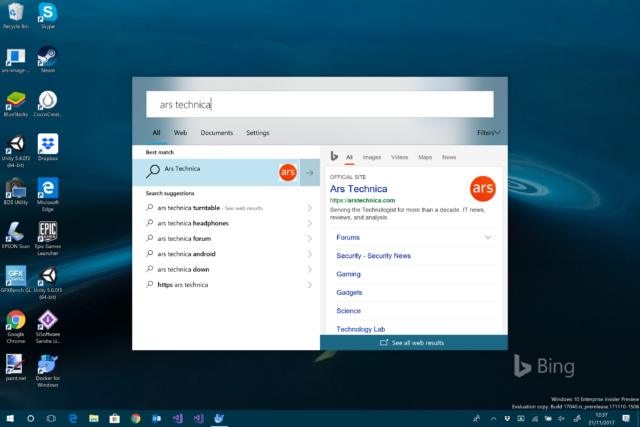
The latest insider build of Windows, build 17040 from last week, has a secret new search interface that looks a lot more Mac-like. Discovered by Italian blog Aggiornamenti Lumia, set a particular registry key and the search box appears in the middle of the screen. The registry key calls it "ImmersiveSearch"—hit the dedicated key, and it shows a simple Fluent-designed search box and results. This solution looks and feels a lot like Spotlight on macOS.

The basic Windows type-to-search interface and experience hasn't changed much since its introduction in Windows Vista. For me, at least, it transformed how I used Windows, and type-to-search is how I've launched most programs, most of the time, for the last decade. The new interface offers much more room for results, and those results can be far more detailed. So while the new interface has some rough edges, it looks like a solid improvement.
As for Cortana, she's not going away. There are reports instead that she's going to be switching away from her current search-like interface to a more conversational interface launched from the notification area. This will make her more similar to Google Assistant.
Source: arstechnica