 2626
2626
 2017-09-25
Today, the team behind Safari’s web browser engine, WebKit, have detailed how designers should be building sites for the iPhone X. The upcoming iPhone’s sensor housing, aka “notch,” has presented new challenges for designers and developers alike. This has left some implementing creative “solutions” for the problem. Having WebKit lay out some official guidelines for the iPhone X should help web developers around the globe.
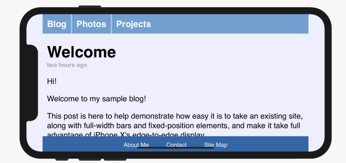
The iPhone X’s sensor housing will present design challenges for websites in their current form. Apple has attempted to mitigate this issue early by padding out a site’s content on either side. For sites that have full-width content, like 9to5Mac, this mitigation may be more unattractive than Apple intended. Many web developers may see themselves slightly tweaking their sites to look as good as possible on the upcoming iPhone X. The WebKit’s team post on designing for the iPhone X provides before and after examples of what developers could do.

With just those two changes, web developers can adapt their sites to look as good as possible on the new iPhone X. Curiously, Apple also makes mention of the min() and max() functions. Both of which are relatively new to CSS, yet neither is available in Safari 11 or iOS 11. (Apple states that they’ll be available in a future version of Safari Technology Preview.)
While not technically challenging, it can prove to be significant work for more complex site layouts. Luckily, the iPhone X’s reported delays may buy web developers time before the sensor housing sees mass market adoption.
Source: gearsofbiz