 2447
2447
 2017-06-06
As expected, today’s WWDC 2017 keynote was absolutely loaded with announcements, from watchOS 4 to macOS High Sierra to a range of new Macs and MacBooks as well as iOS 11, but it’s not over yet. In the back half of the event on Monday, Apple announced a complete redesign for the App Store.
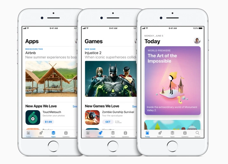
Unsurprisingly, the new App Store features many of the same design principals as the big Apple Music revamp from last year. When you open the redesigned App Store, you’ll be presented with a “Today” tab, which features colorful, screen-filling cards that you can scroll through to see what’s new.

At the bottom of the App Store, you’ll find five tabs: Today, Games, Apps, Updates and Search. So in iOS 11, games have their own tab, separate from the rest of the apps and easily accessible from anywhere in the App Store. Although the tabs are similar to the categories currently on the App Store, they have been given an attractive facelift with larger images, more detailed descriptions and video streams of gameplay that start automatically on the page as the user scrolls down.
Functionally, the App Store will be basically the same, but navigation is going to be majorly improved, if the stage demo was anything to go by. The App Store hasn’t received a major redesign since it launched, so this is a big step for Apple. It should also make developers happier by finally splitting up Games and Apps. Now that new weather app won’t have to fight for real estate with Pokemon Go.
Source: bgr