 5211
5211
 2017-11-07
Some iPhone X users are already complaining about a design element of the new device — and, surprisingly, it’s not the infamous sensor notch.
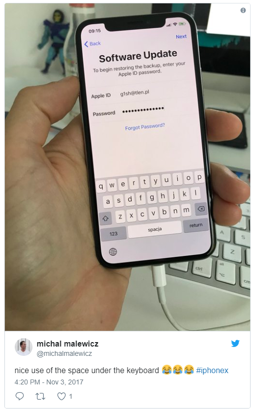
Early adopters of the premium OLED handset have taken to Reddit, Twitter and other outlets to point out the “unused” space beneath the keyboard in iOS 11 on the iPhone X. In one tweet, an iPhone X owner said that the sensor notch is “not a big deal” but the “massive grey bar” situated beneath the keyboard is a “ridiculous waste of space.”
Indeed, underneath the new keyboard, there is quite a bit of gray negative space between the Globe and Dictation icon. Aesthetics are objective, of course, but it’s really not the most visually pleasing use of that area.
Apple likely purposely designed the iPhone X’s keyboard that way for ergonomic and user interface reasons. Without a Home button, the iPhone X uses a set of gesture-based controls to go Home and to activate certain features like the App Switcher. In place of an analog button, Apple has added a “Home bar” that sits at the bottom of the iPhone X’s display.

With the bar where it is, it’s likely a bit easier to swipe-up to go home without randomly hitting a key, for example. On the other side of the spectrum, it might be a buffer to help keep some users from inadvertently going Home while they’re typing out a message.
Anyone who’s tried to open the Control Center in iOS with an active keyboard can attest to this.
Additionally, a keyboard placed lower on the device would probably have been more difficult to type on.
Despite that, it’s hard to deny that there might be some slightly more innovative uses for that space.
Whether or not Apple has plans for the dead space in future iOS updates is up for debate. It’s also unclear whether third-party keyboard or app developers will even have the ability to use that space. The only mention of the keyboard in Apple’s iPhone X interface guidelines concerns the Globe and Dictation keys — and specifically asks developers not to duplicate them in their own app designer.
Third-party keyboard app SwiftKey even said that they’d “have to look into it” when asked if their keyboard would fill that part of the screen, and added that there’s “nothing to comment on beyond that.”
Source: idropnews