 4516
4516
 2017-09-28
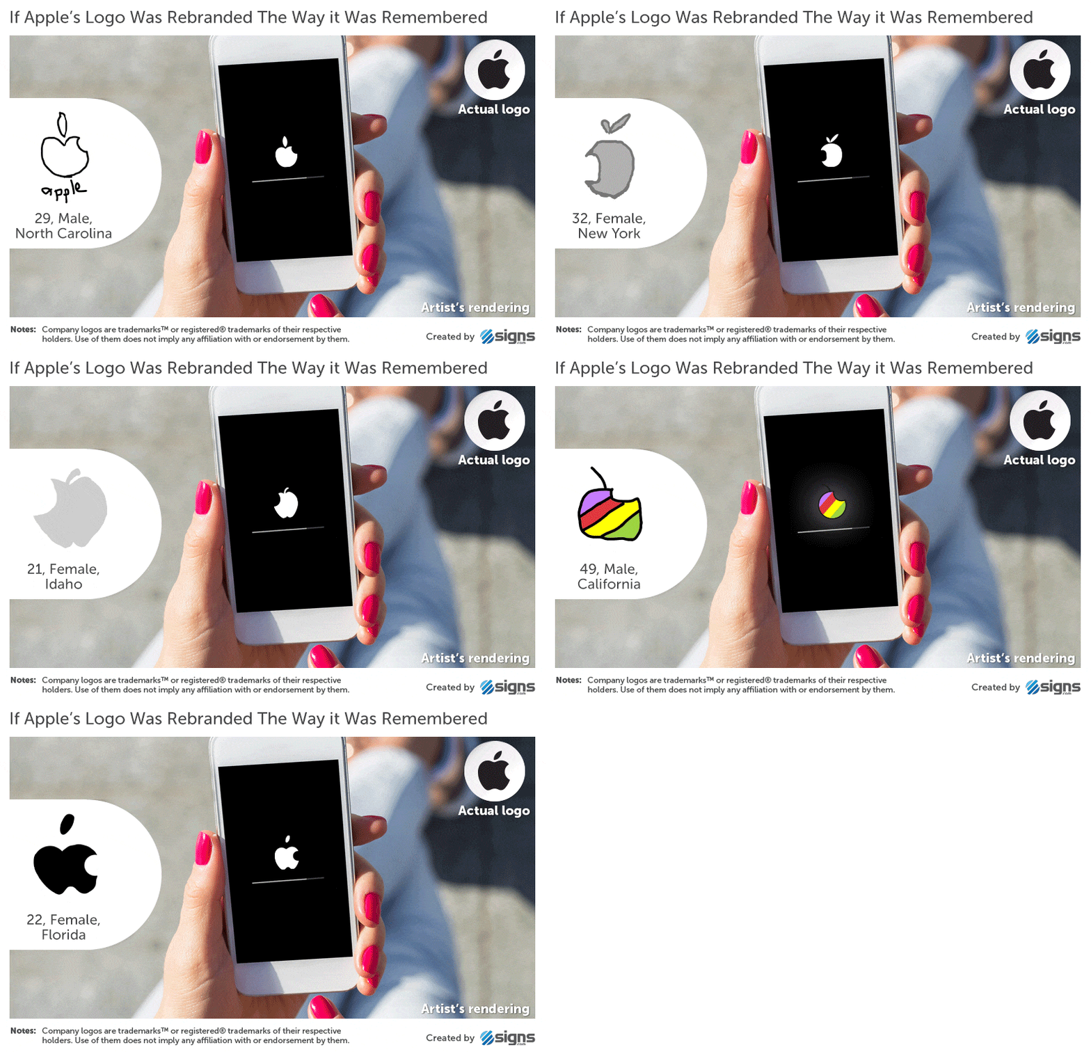
As the world’s most valuable company, with one of the most recognizable logos in corporate history, you’d think that most people would be capable of drawing the Apple symbol with some degree of accuracy. Especially since it appears on the devices that millions of us carry in our pockets every day.

In fact, a new survey called Branded in Memory shows that more people get the Apple logo wrong than get it right when sketching it out. Check out the most common mistakes below.

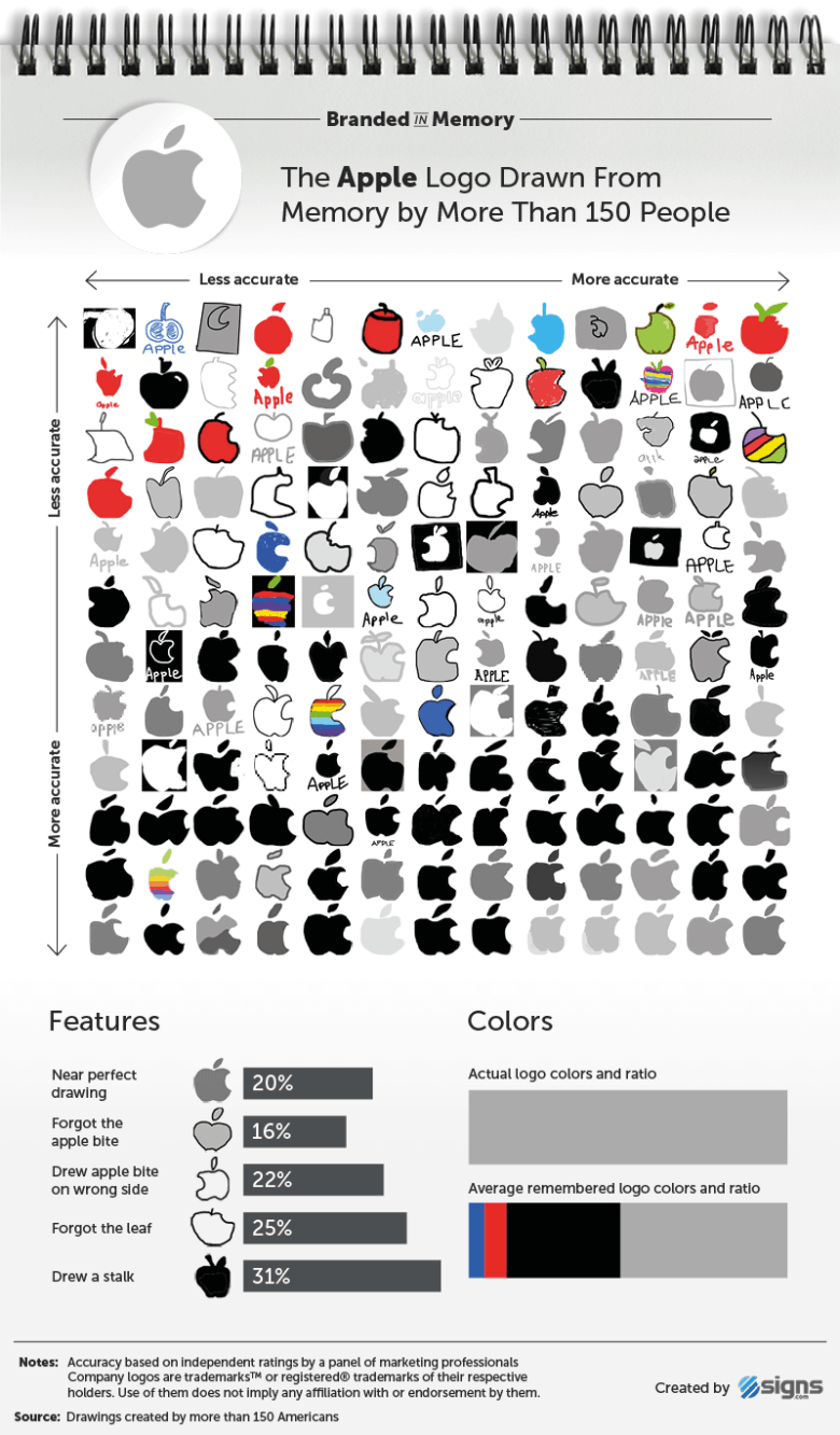
Out of a group of 156 Americans asked to draw the Apple logo, just 1 in 5 were able to draw it accurately — meaning the right combination of bite, floating leaf, and overall shape and proportion.
The most common mistake, made by almost one third of people, was to include a stalk on the apple. One in 4 meanwhile forgot to add the bite in the apple, while 22 percent draw it facing in the wrong direction. 15 percent did the same thing with the leaf, which they drew facing left rather than right.
Six percent colored the logo right instead of gray or black, while slightly older respondees with an average age of 42 were a bit more likely to draw the logo with rainbow stripes, reflecting how it looked up until 1998.
Bad corporate logo?
Does this make for a bad corporate logo, then? Given how recognizable the Apple logo is, obviously not. Intriguingly, the effect of people being unable to reproduce symbols they see every day is not limited to Apple. A famous 1979 memory experiment concluded that half the U.S. population thought that Abraham Lincoln faced left, instead of right, on a penny coin.
The same Branded in Memory study also found that 1 in 5 people people mistakenly think the Foot Locker referee wears a hat, while almost half of people think the Starbucks mermaid doesn’t wear a crown. You can check out more of the conclusions here. Also check out our post on the history of the Apple logo here.
Could you draw the Apple logo accurately without using the real one for reference? You may surprise yourself.
Source: cult of mac