 4952
4952
 2017-05-26
Apple has today officially transitioned away from its aging press portal in favor of the modern Apple Newsroom, which combines company press releases, photo coverage and other news into one place. All links to apple.com/pr now redirect to apple.com/newsroom.
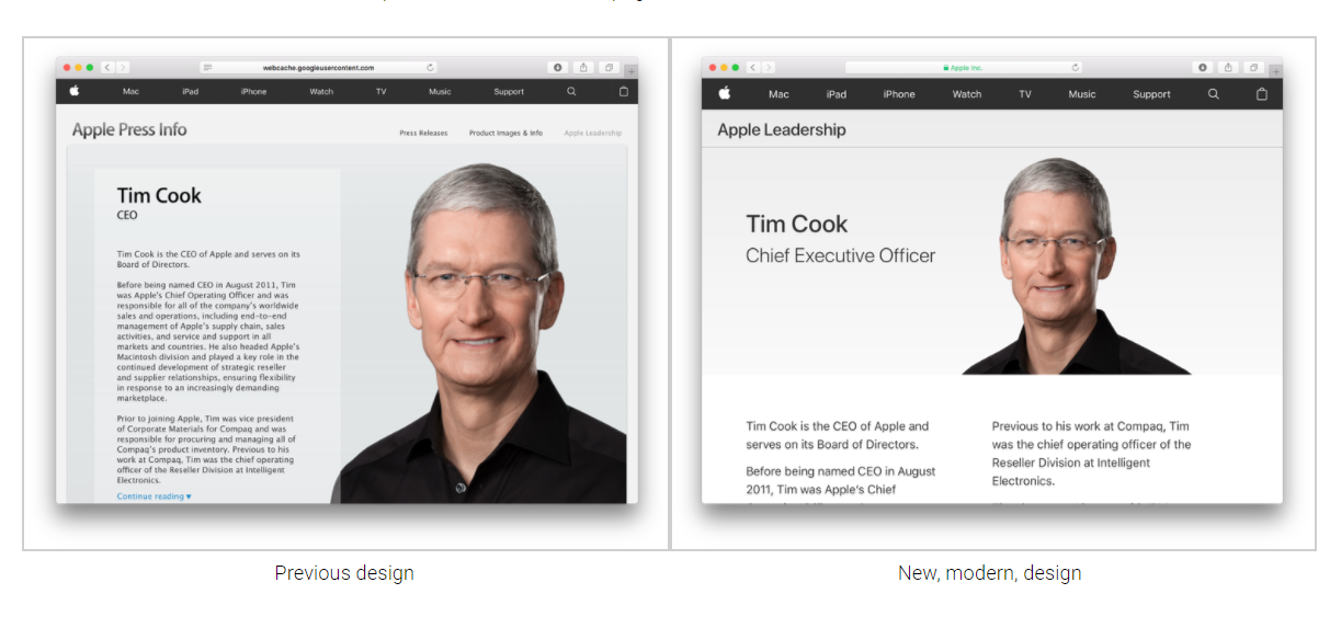
At the same time, the company has also updated its executive biography pages with a fresh design update to fit in with the company’s recent website design trends and adopts the San Francisco typeface, finally retiring the Lucida Grande font.

The default Newsroom page focuses heavily on imagery, resulting in a pretty appearance but low information density. An Archive view exists for journalists that just want to see a compact list of press releases.
The refreshed Apple Leadership page removes the extraneous surrounding chrome and focuses on the Apple executive’s photos and titles. The site now resides at a new URL: apple.com/leadership.
The design of detail pages for individual executives have also been modernized, with a simpler header and two-column text layout.
Any outdated elements present in the previous design, like the bezelled content view or janky ‘Continue reading’ pagination, have been removed.
You can see a comparison of Tim Cook’s bio page in the screenshots below.
Source: 9to5mac